Introducing a new look to the app! 💅
Coming soon to a mobile device near you, the redesigned layout brings big changes to your Element app.
With a focus on improving our users' workflows, we’ve ensured the app is cleaner, easier to browse, and faster to navigate, while keeping all the Element goodness!
Over the last few weeks and months our mobile teams have been working hard researching, designing and building a new home page for both iOS and Android Element apps. If you haven’t seen it already, it’s now available on iOS (and coming soon to Android).
What’s changed?
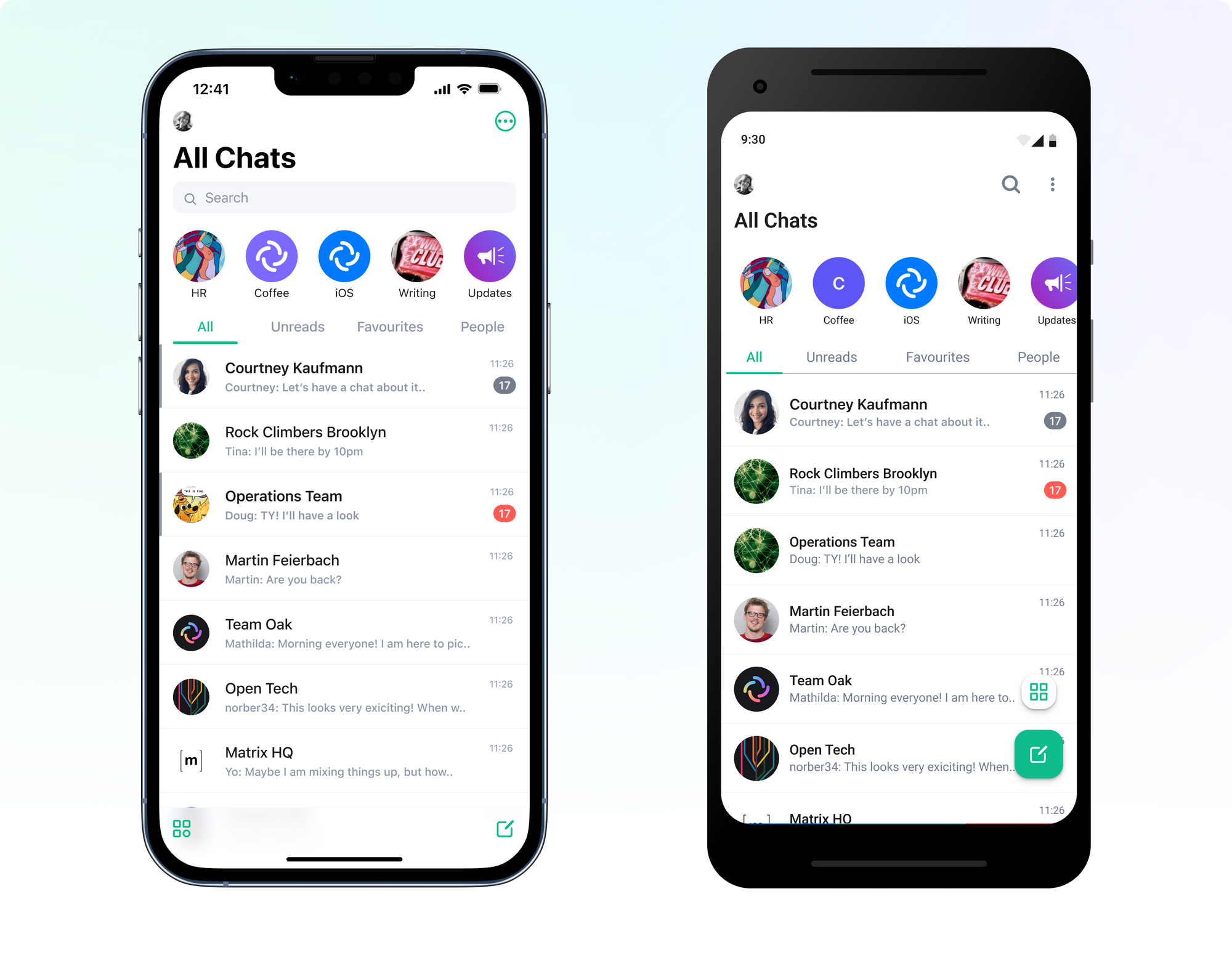
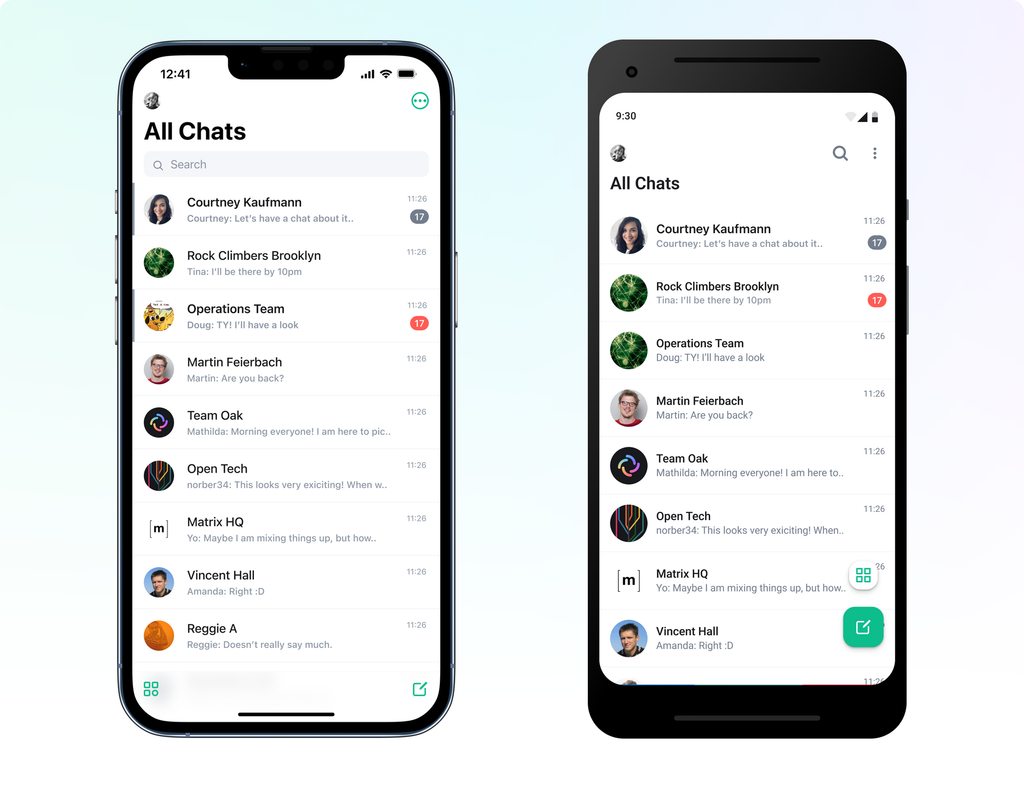
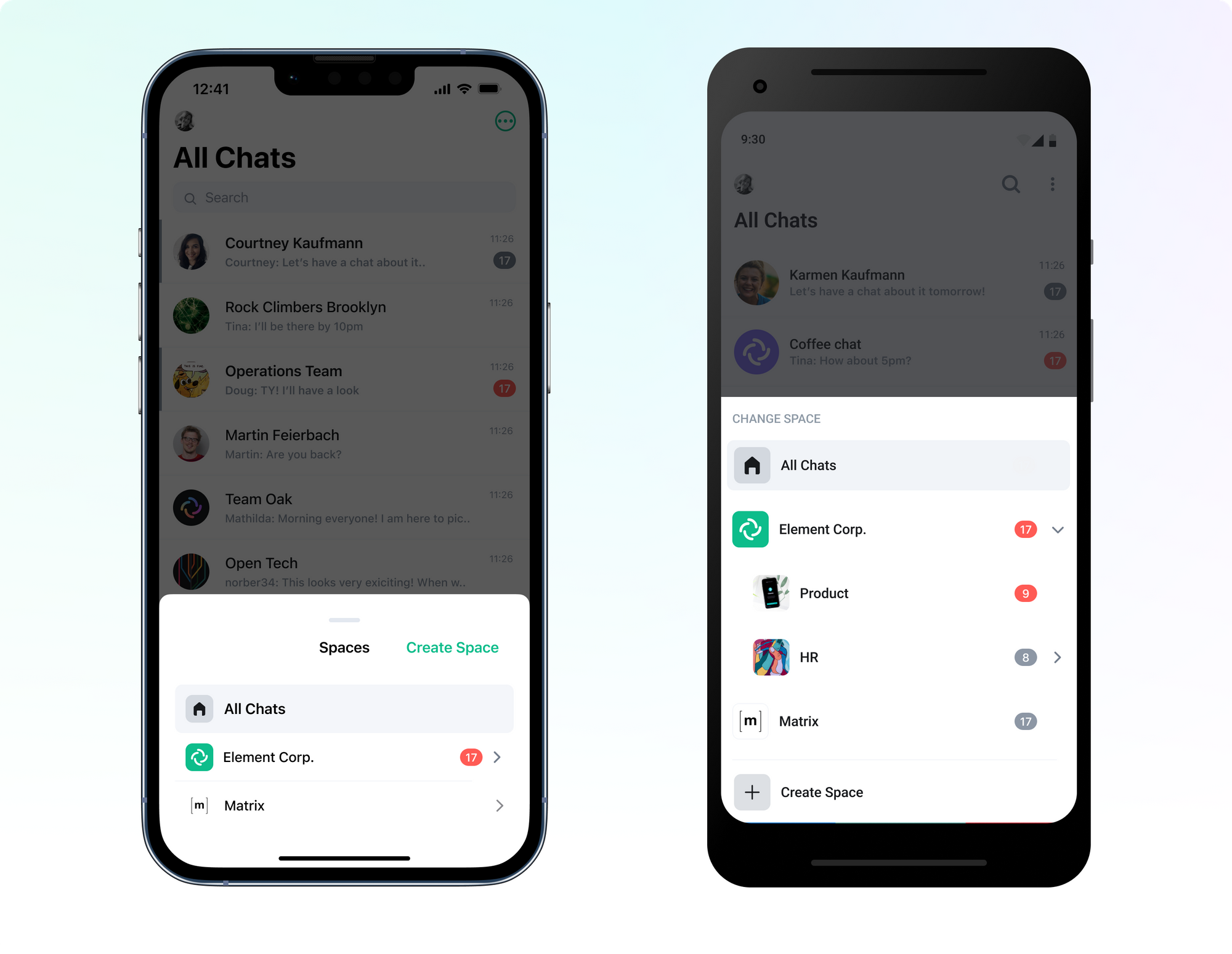
No more tabs!
While the split between Rooms and People can be useful on the Web app, we’ve received plenty of feedback that it doesn’t make it any easier to find what you’re looking for on a mobile device.
Previously, when users open their phones to find a chat, or respond to a notification, it could take several clicks to find the right tab and access the right room (and sometimes rooms weren’t where you expected or wanted them to be 🤦!)
So we’ve listened and we’ve changed it! With one list you’re able to see both People and Rooms all in one place.
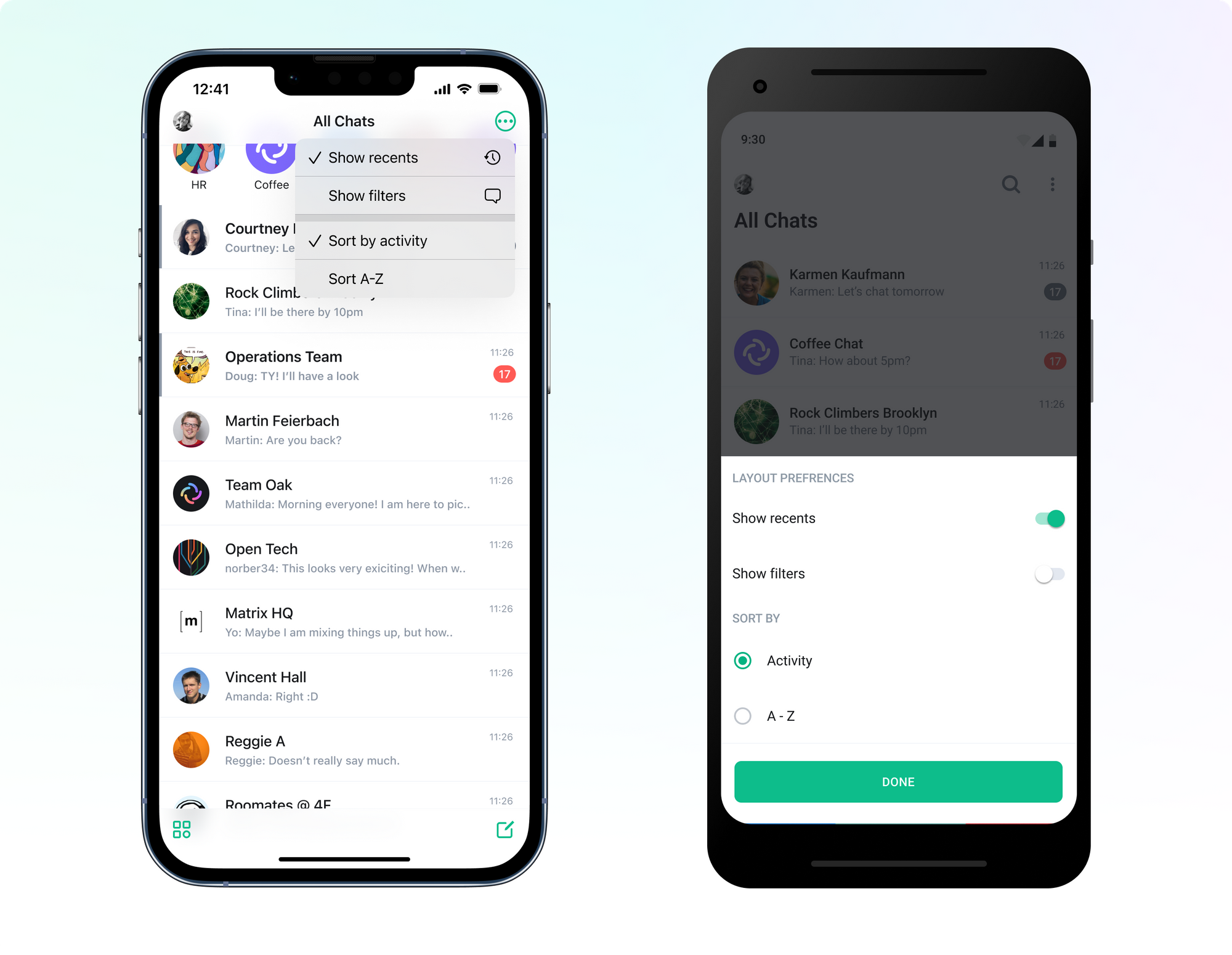
Customise your view
In case the prospect of a singular list for all your chats worries you, don’t panic; we’ve got you covered.
You can use ‘Filters’ (found in the overflow menu) to easily see Unreads, Favourites and People if you’d rather. They’re off by default, so remember to turn them on if you have a preference for having multiple filters.
We’ve also added a toggle for ‘Recents’ allowing you to see or hide your most recently viewed rooms, just like on the Web app. Again, it’s off by default but please go ahead and check it out. We want to maximise your ability to make the app how you want it - without overwhelming new users with too much info or a crowded home page.
Spaces, spaces, spaces
Spaces is a relatively new feature in Matrix and Element, and with our new app layout update we’ve channelled our inner Bob Ross and given it a fresh coat of paint.
Instead of finding Spaces in the archaic hamburger menu, you can now access it via the Spaces icon:

This is in a different location on iOS and Android as we’ve chosen to follow the platform design guidelines and design idioms.
Accessing the Spaces menu will now open a dedicated Spaces view so the whole screen can be used to see and navigate your folder structure quicker and easier than before.
iOS-specific changes
On iOS, the biggest change you'll notice when opening the updated app is that there’s no more horizontal scrolling! We heard loud and clear that while the horizontal homepage allowed us to group things, it felt unnatural and clunky.
If you’ve been an iOS user for a while you may have been using toggles that pin certain rooms to the top of your list. You can still order your room list like before, although you might have to double-check that ordering in Settings (under Notifications) still makes sense for you with the new layout.
Android-specific changes
For a while we’ve had an optional “Notifications” tab on Android. It’s been hiding away in Labs but it’s finally here to stay. However, instead of being a tab, it’s now with Filters and can be toggled on and off from your homepage.
How did we get here?
Our journey started with a lot of research; We looked at everything from other apps in the market, through to trawling our whole GitHub backlog. We knew that our app was due an upgrade, but we needed to understand what was working, and what wasn’t.
Once we had a good understanding of how people were using Element, the things they were struggling with, and things they liked, our team set to work at reimagining the app from the ground up. We spent a lot of time drawing, redrawing, and iterating on several different proposals of how we might improve and simplify our homepage for all our different user groups (which stretches from individuals, through to communities, small and large businesses, and entire governments).
After finding a few directions we were confident with, we went back to research but this time with prototypes. We invited users, community members, and customers to join us for several different research sessions and collected over 300 pieces of feedback.
Then it was time to perfect the design. With all this feedback, we have been able to refine and scale the designs to what we see today.
It’s important to us that our users are heard and that our app delivers what people want. Your feedback was, and will continue to be, carefully reviewed and implemented as best we can - so thank you, and we hope you continue to help us improve! To hear about future research sessions, head over to our Element Community Testing room.
What’s next?
Coming next is the full release across both mobile platforms. While we tried our best to release on both platforms at once, it just wasn’t possible this time around. Never fear - there’s only a few extra days to wait for our Android users and you’ll be able to download the new app and experience all the fun too.
We hope you like the new design as much as we do! That said, we are always looking for feedback and ways to improve, so please use the Feedback button found on the context menu on the room list to send us any thoughts.